iOS App, WaveLength
WaveLength is a (hypothetical) iOS app that helps roommates communicate better.
WaveLength uses automated reminder notifications to help roommates accommodate each others’ living priorities with minimal conflict.
Business Goals:
Encourage new users to complete the onboarding flow and engage with the app regularly
Project Length:
3 months
User Goals:
Improve communication and eliminate misunderstanding between roommates
My Role:
UX Designer, User Researcher
Inspiration:
Many roommate conflicts I could have avoided by better communication.
Research revealed the primary sources of conflict among roommates.
I interviewed five young professionals in Seattle with roommates in order to better understand what their main frustrations were with their living situation.
I hypothesized that a lack of organization was the primary issue that roommates faced, However, the interview data indicated that a lack of understanding of roommates’ personalities was a more common concern, especially among roommates who didn’t know each other previously.
I decided to design the app with individuals in mind who did not previously know their roommates, since this group seemed to experience more communication breakdown than roommates who were already friends.
I created the persona below to humanize the needs of this group of users.
Prototyping & testing illuminated what features would help users communicate better with their roommates.
I began to brainstorm possible solutions to solving this lack of communication between roommates. Finding a solution that was not passive-aggressive proved difficult!
I ended up choosing to prototype/test an app that would use automated reminder notifications to remind each other about pre-selected priorities.
Initial sketches - some of these were quite passive aggressive!
The solution I decided to test: a reminder-based app that serves automatic notifications based on priorities that roommates select ahead of time.
I built a pen-and-paper prototype of this solution, testing it with five individuals to see if it would solve potential frustrations with their living situations.
During this early testing, my users alerted my attention to points of confusion for them, such as the fact that the purpose of the reminder notifications was unclear.
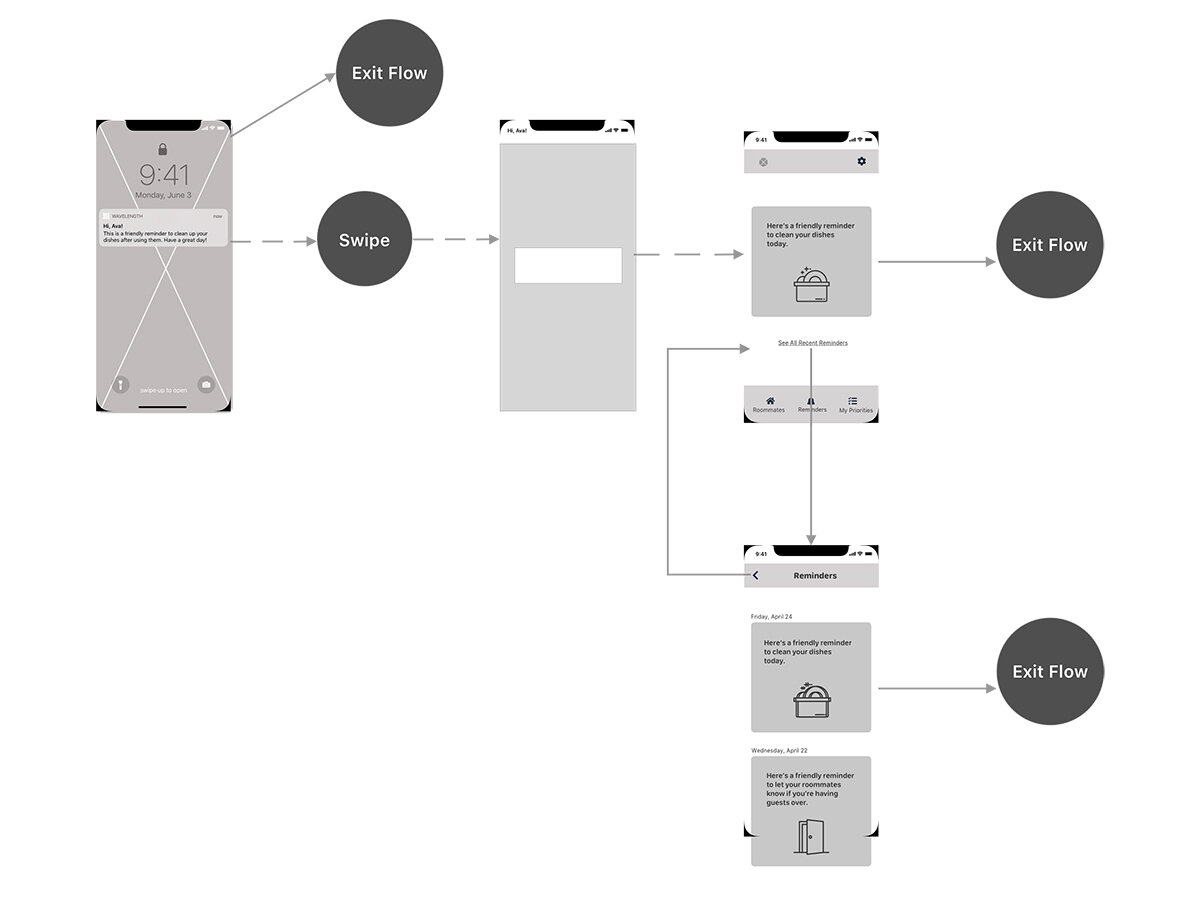
With these issues in mind, I created greyscale wireframes in order to work within the constraints of an iPhone and start to figure out which UI patterns to choose for the best interactive experience.
The greyscale wireflow for receiving and responding to reminder notifications
I created a realistic high-fidelity prototype in order to gather more specific feedback from users.
Sample Hi-Fi Screen #1: Signup Screen for Joining an Existing Household
Sample Hi-Fi Screen #2: Tutorial Screen Explaining Notifications
Creating a UI component library maintained consistent CSS and branding.
I also created a UI component library so that, if this app were to developed, the front-end engineers could save time by reusing components. Using the component library also keeps the app’s brand messaging consistent.
Using the high-fidelity prototype, I conducted five usability tests to determine the primary issues that were preventing users from completing their tasks.
Here is some of the feedback I got from the first test:
I made sure the tutorial was the most prominent feature on the welcome screen and reiterated multiple times that the app was sending reminders, not roommates! I also clarified on the priorities screen and in the tutorial that the priorities were individual and not collective.
I completed one more round of testing, which yielded a 100% task completion rate.
I learned to always test assumptions and have a concrete reason for every element of my design.
This project was my first real experience applying a Design Thinking process from research all the way to visual design.
I also fell in love with the whole process. It’s the perfect balance of analysis, creativity, and human interaction.
Attribution:
“Heart,” “Speech Bubble,” “Group,” and “Sweeping” icons made by Freepik on www.flaticon.com
“Calendar,” “Sofa,” and “Settings” icons made by Pixel Perfect on www.flaticon.com
“Toilet” icon made by Creaticca Creative Agency on www.flaticon.com
“Moon” icon made by iconixar on www.flaticon.com
“Dishwashing” icon made by pongsakornRed on www.flaticon.com


