WaveLength | UX Design/Research, iOS App
““WaveLength helps you and your roommates find your groove.””

Project Summary
What is WaveLength, and what problem does it solve?
WaveLength is an iOS app that uses reminder notifications to help young professionals communicate better with each other.
Business Model:
Paid iOS app (iOS contains 60% of the US mobile phone market)
Project Length:
3 months (Beginning of March-end of May 2020)
Tools:
Sketch, InVision, Marvel, Zoom, Pen/paper
Users:
Young professionals (age 22-35) in Seattle, WA, who live or have lived with roommates recently
Project Team:
Just me! (personal project)
My Role:
UX designer, user researcher
My Design Process

Building Empathy
“What frustrates Seattle young professionals about their living situations?”
As a young professional in Seattle, I am part of the target demographic, but I can’t assume my experience matches everyone else’s. After all, I’m only a sample size of one, which makes for weak statistical significance.
I needed more data to accurately define the problems my audience was facing. To get the data, I interviewed five other young professionals in Seattle who lived with roommates or had lived with roommates recently.
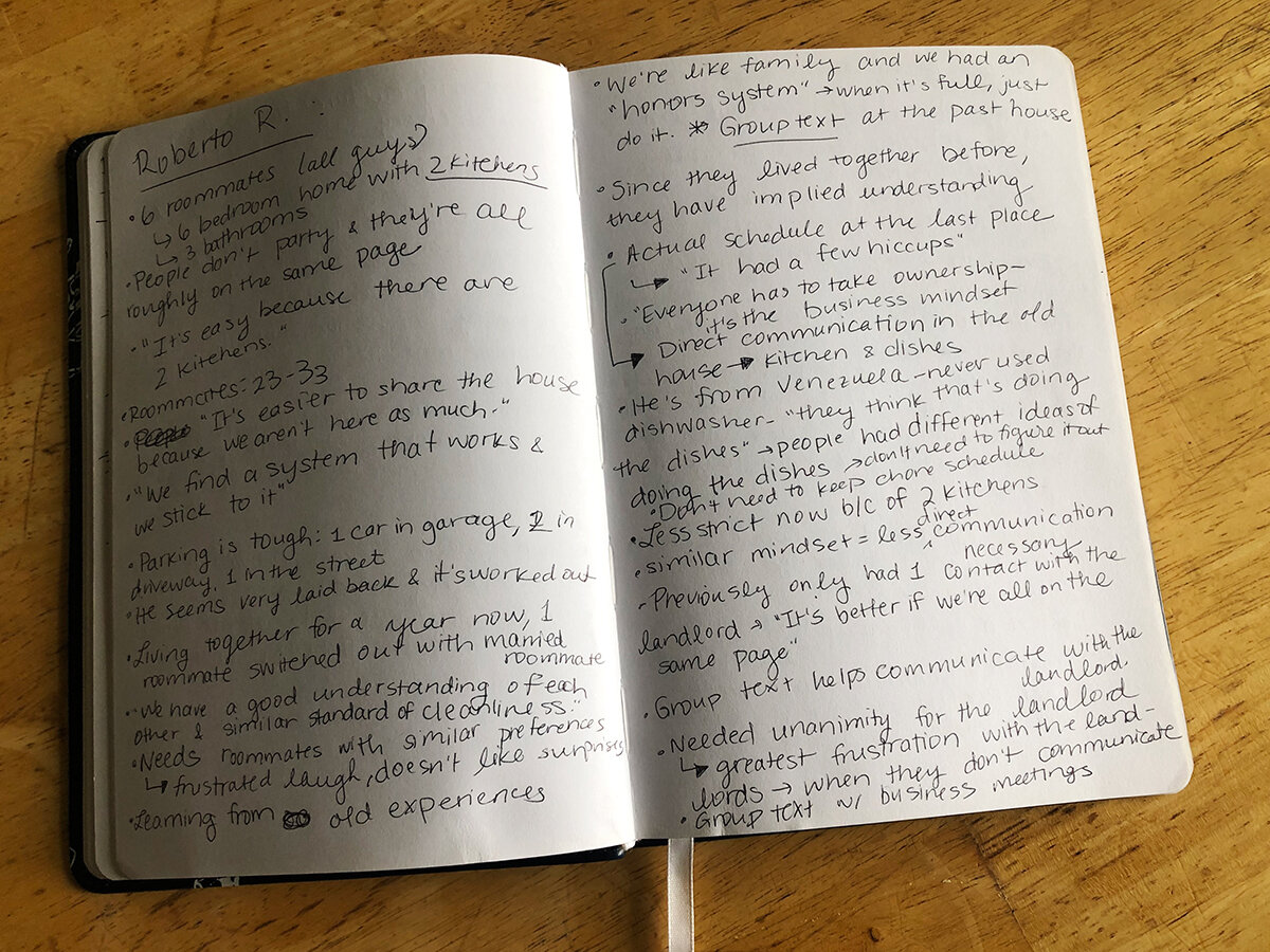
Interview notes. Clearly, even one interview provided tons of new insights!
Interviewing users challenged my initial assumptions about the problem and gave me a sample of qualitative data that would help me define my users’ main problem.
But first, I had to organize the data to make more sense of it.
Defining the Problem
“What frustrations did my users have in common? How would I summarize the main problem?”
Prior to this project, I had assumed that most roommates had a formal way of organizing their chores and plans. However, through my interviews, I learned that this was not the case for most roommates who are already friends.
Instead, I learned from my users that their main frustration was a misunderstanding of what each other valued in terms of their living situation.
With a grasp on the main problem, I created a persona to humanize and summarize the data.
“Main Problem Summary: How might we help Ava Acquaintance and her roommates be on the “same page” in terms of household dynamics?”

Ava Acquaintance - my primary persona. She represents individuals who are living with people that they didn’t know well beforehand.
Ideating Possible Solutions
“What are some possible ways we could help to solve this problem?”
With the main problem defined, I began to explore possible solutions to the communication breakdown that roommates experience.

Yikes - some of these ideas would have been quite passive aggressive! I’m glad I checked in with my mentor before prototyping some of these.
A challenge I encountered was finding a solution that does not come off as passive aggressive, as this could make communication worse! I cycled through and threw away many ideas until I landed on one that could improve communication without falling into the passive aggressive trap - a mobile app centered on reminder notifications.

Much better - a reminder-based app that serves automatic notifications based on priorities that roommates select ahead of time.
Prototyping and Testing the Main Concepts
“How do my users feel about the solution idea? Could it effectively solve their problem?”
Now that I had come up with a solution, it was time to build a simple prototype that I could test on real users to see if it solved their problems. In order to save time and keep the focus on the main concepts of the app and not the fine details, I built my first prototype out of pen-and-paper sketches (see below) and performed remote moderated testing with users.
During this early testing, my users alerted my attention to points of confusion for them, such as the fact that the purpose of the reminder notifications was unclear.
With these issues in mind, I created greyscale wireframes in order to work within the constraints of an iPhone and start to figure out which UI patterns to choose for the best interactive experience.
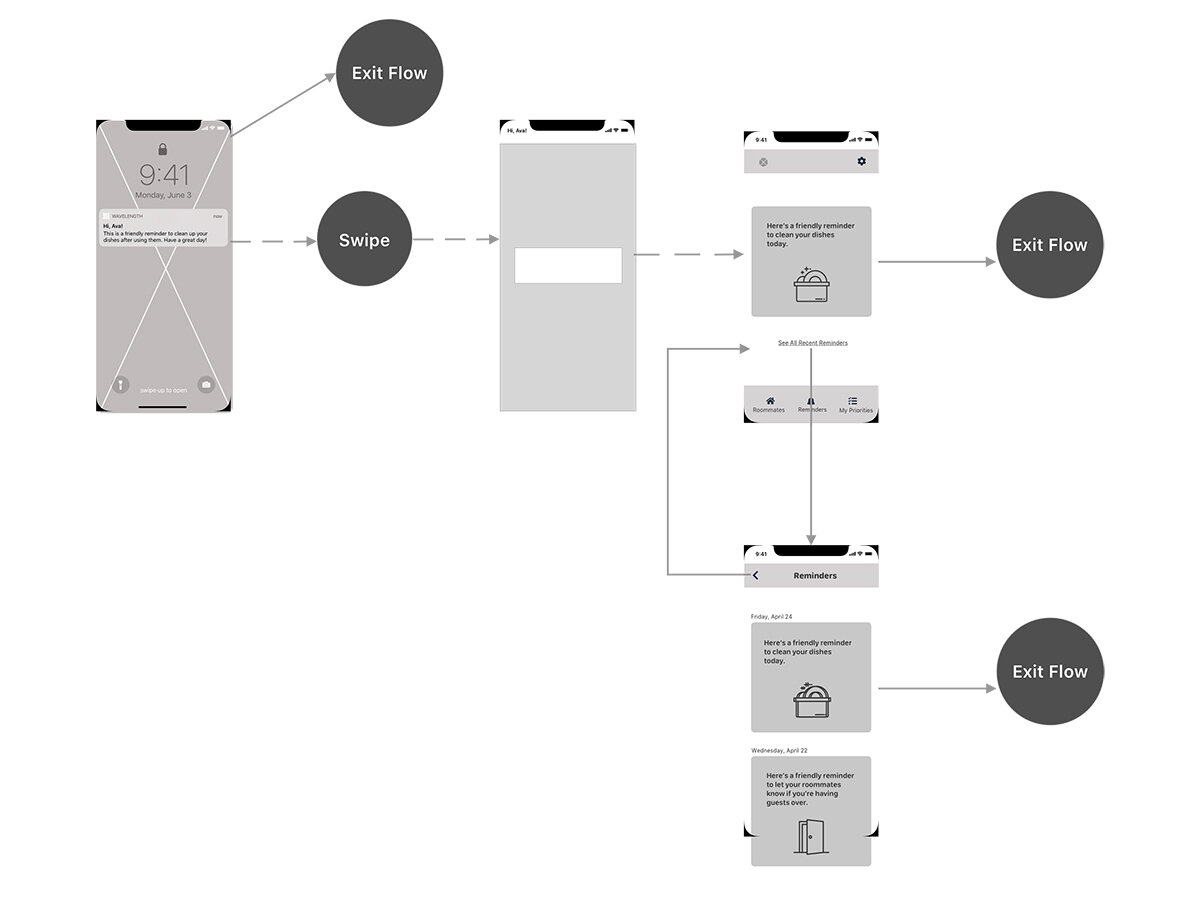
The greyscale wireflow for receiving and responding to reminder notifications
Prototyping and Testing the Fine Details
“How do users feel about the specific features of the solution? What can I change to make their experience better?”
Once I’d determined the basic structure and flow of the app, I began to create a realistic high-fidelity prototype that I could use to test my interaction design and branding choices with my users.
Sample Hi-Fi Screen #1: Signup Screen for Joining an Existing Household

Sample Hi-Fi Screen #2: Tutorial Screen Explaining Notifications

Usability Testing: What Do I Still Need to Fix?
Using the high-fidelity prototype, I conducted five usability tests to determine the primary issues that were preventing users from completing their tasks.
Here is some of the feedback I got from the first test:


Clearly, there were some critical issues that needed to be fixed before I could send this app into development (hypothetically). I made sure the tutorial was the most prominent feature on the welcome screen and reiterated multiple times that the app was sending reminders, not roommates! I also clarified on the priorities screen and in the tutorial that the priorities were individual and not collective.
I tested with five more users to see if my edits had fixed these blaring issues. In general, users did not express frustration about any of these three issues. 100% of users were now able to complete the three tasks without significant issues.
If this were a client project, this MVP would be ready for some code!
What I Learned from This Project

This project was my first real experience applying a Design Thinking process from research all the way to visual design.
During this process, I learned that:
I can never talk to users enough.
I should always have a defense ready for my design decisions.
I should always get another pair of eyes on my designs.
I also fell in love with the whole process. It’s the perfect balance of analysis, creativity, and human interaction.
As far as this specific project, the next step I would take would be to implement user feedback from the second round of testing and handoff the app to the developers. After the release of MVP 0, I’d interview users again to figure out what feature I should start designing next. And after that, more prototyping and testing!
If you haven’t already, be sure to watch the prototype video or check out the interactive prototype.
Attribution:
“Heart,” “Speech Bubble,” “Group,” and “Sweeping” icons made by Freepik on www.flaticon.com
“Calendar,” “Sofa,” and “Settings” icons made by Pixel Perfect on www.flaticon.com
“Toilet” icon made by Creaticca Creative Agency on www.flaticon.com
“Moon” icon made by iconixar on www.flaticon.com
“Dishwashing” icon made by pongsakornRed on www.flaticon.com